Web Accessibility pre-research
A first look at accessibility
Amelia Gianoli 2026-2-25
Web Accessibility Pre-Research Worksheet
Part 1: Understanding the Landscape
1. What does "web accessibility" mean to you? Write your initial definition before looking anything up.
Accessibility to me means that anyone can utilize the web page, regardless of physical limitations.
2. Who do you think benefits from accessible websites? List as many different groups of people as you can imagine.
Everyone benefits in some way. Obviously those with a physical disability (such as screen reader compatability for the blind) are the intended target, but everyone benefits from an alt image description if the image fails to load properly, or when that alt tag allows it to be found with a search engine. Having tab stops and input field tags would greatly help someone that may struggle with using a mouse for some reason, but it also benefits those using a laptop with trackpad, or those of us that just prefer to primarily use a keyboard.
3. Think about a website you use regularly. Can you identify any features that might help someone with a disability use it? (Examples: buttons, navigation, text size, etc.)
Skyward is the website that the school district uses and it is one of the most terrible user experiences I have ever had. It is difficult to navigate, once you log in it opens in a new bare-bones window, the mobile version doesn't scroll correctly, and that is just the tip of the iceburg. To improve it, I would fix the media query and make it more mobile-friendly. Simply adjusting the font size and layout would make it easier to read/navigate. The forms are very basic (like, Web I basic) so putting a little bit of effort into styling them would make it a more positive experience. Adding in buttons instead of links to things would make it easier to navigate as well.
4. What types of disabilities might affect how someone uses the web? Try to list at least 5 different categories.
Physical: Physical conditions may limit the way one can actually interact with the computer screen or device that they use to navigate the webpage. Being able to navigate using only a keyboard and not relying on a mouse could help someone that has a condition such as tremors or anything that affects fine motor control. Being able to navigate with buttons instead of links would allow you to adjust the size of buttons to be easier to click.
Sensory: limitations such as vision or hearing loss would greatly affect how one interacted with a webpage. Needing to use a screenreader would put you at the mercy of whoever designed the page, and you would just have to hope that they tagged everything appropriately and used alternative text, etc. Hearing would probably be less impactful, but making sure any audio/video is properly captioned would negate most of this.
Intellectual/Developmental: Having an overstimulating page, or a page that is too 'busy' could prove to be a barrier to someone with ASD or another developmental challenge. Having things very clearly labeled and having a well-designed site map could aid in navigating your page.
Mental/Behavioral: Much like the Intellectual/developmental category, designing a page that is more streamlined and free from extra distractions can aid those that struggle with mental or behavioral challenges. A consistent layout, and logical structure will go a long way towards a positive user experience.
Learning/Neurological: Individuals with these challenges often require simple, consistent, and predictable design. So all the same strategies for the previous two categories also apply here. Additionally being mindful of font choice (maybe provide the user with a way to adjust font settings?) and size is important.
Part 2: Exploring Barriers
5. Close your eyes and try to navigate a familiar website using only your keyboard (no mouse). What was difficult? What was impossible?
It was impossible. Regardless of how much I use Blackboaard on a regular basis, I am not equipped to navigate it without sight or a mouse.
6. Turn off the sound on your device and watch a video. What information did you miss? How did this change your experience?
I watched the first 30 seconds of the Strings API video and it was a challenge. Even with CC on, the nuances and tone were completely missing. It was all one run-on sentence, so I had to guess at where the breaks and pauses were to make it more understandable. Even knowing the content, I was still confused and overwhelmed trying to process what I was reading (and having to read while seeing what was being displayed in the video).
7. What barriers might prevent someone from accessing web content? Think beyond just the disability itself—consider technology, design choices, and other factors.
Going back to my Skyward example, the layout and design of it makes it so I do not use the page. There are things that I could take care of myself that I will instead call the school to take care of, or go in and talk to someone. Technology can be a barrier. If I did not have access to a computer and was relying solely on mobile devices, I would avoid a lot of sites (such as blackboard). Conversely, if I only had computer access, I wouldn't use tools like Google nearly as often. When it comes to quickly looking something up, I almost always reach for my phone, even if I have my computer up and running. Large/inefficient websites may take too long to load based on internet connection and processing power of the device accessing it.
8. Have you ever encountered a website that was difficult to use? What made it frustrating? Could those issues also affect people with disabilities?
Almost every website I have interacted with has some drawback that detracts from a positive user experience. Usually it is a navigation issue (site maps are not as ommon as they used to be) or layout/style issue. The thing is, besides the undiagnosed ADHD, I am a fairly neurotypical person with no physical limitations. If these small things are leading to a negative user experience for me, I can almost guarantee that someone with more challenges is struggling even more.
Part 3: Legal and Ethical Dimensions
9. Do you think website owners have a legal obligation to make their sites accessible? Why or why not?
Do they have a legal obligation? My understanding of ADA law would say yes they do. Should they have a legal obligation though? Maybe not. That will be discussed more in the next question....
10. Should all websites be required to be accessible, or only certain types? Explain your reasoning.
I think all public access websites should be required to be as accessible as possible. Private business sites I do not think should be required to do so, but it would almost always be in their best interest to do so. Typically, if a site is difficult to navigate or use, the business is going to lose out on revenue.
11. What might be the consequences (legal, financial, social) for organizations that don't prioritize web accessibility?
Legally, they may open themselves up to lawsuits or fines from regulatory bodies. Financially, there would be a loss of revenue as there would be potential customers that would turn elsewhere and find a vendor that is more accessible to them. Socially, if they are not accessible, they will inevitably receive bad publicity and that will have further financial consequences.
12. Beyond legal requirements, what ethical reasons exist for making websites accessible?
Ethically, we should be trying to make all goods and services available to the widest possible audience. We should be striving to not exclude anyone, deliberately or accidentally.
Part 4: Technical Considerations & Coding for Accessibility
13. Look at this button code: <div onclick="submitForm()">Submit</div>
What accessibility problems might this create? How would you improve it?
It is only able to be submitted if the user "clicks" the "Submit" text; it is not an actual button. This is a barrier to anyone that cannot use a mouse or trackpad for some reason, nor would it be an automatic tab stop. to improve it, it should be changed to <form><button type="submit">Submit</button></form>
14. What is the purpose of the alt attribute on images? When should it be empty (alt="") versus having descriptive text?
Alt text provides a description for screen readers to read and also provides a descriptor if the image link is broken for some reason. According to AI, instances where the alt should be blank are:
- when it adds no meaningful information, is just for styling, or repeated visual flair. Example would be a divider line
- Redundant images. Example would be if the information is already provided in nearby text (such as an image caption)
It also indicated that best practice is to make sure to include thealt=""so the screen reader does not read the file name instead
15. Examine this form field:
<input type="text" placeholder="Enter your email">
What's missing that would help screen reader users? Rewrite this code snippet to be more accessible.
It has no label for the screen reader to read, so it would not consistently announce "enter your email." Furthermore, the placeholder goes away once user starts typing, so it would not reliably be able to be tabbed back to. The more accessible route would be:
<label for="email">Email</label>
<input type="text" id="email" placeholder="Enter your Email">
16. What is semantic HTML and why does it matter for accessibility? Give examples of semantic elements versus non-semantic alternatives (e.g., <button> vs <div>).
Semantic elements describe what they are, not just what they look like. For example, <main>, <button>, and <form> are a main element, button, and form elements respectively. Without prior knowledge, things like <div> are not intuitive in what they actually are.
17. A student creates a custom dropdown menu using only <div> and <span> elements with JavaScript. What accessibility issues might arise? What attributes or techniques could make it accessible? (Hint: research ARIA attributes like role, aria-expanded, aria-haspopup)
Using the <div> and <span> elements do not define what the elements are doing, if the dropdown is expanded, or what the result will be. It also does not allow for keyboard navigation/interaction.
ARIA is a supplement, not a replacement. This means that if native HTML is sufficient, use that instead.
ARIA stands for Accessible Rich Internet Applications.
- Role defines what something is
- Expanded tells if something expandable is open or closed
- Haspopup indicates if element will open a popup
17a. What does ARIA stand for and what is its purpose? Research and explain what these ARIA attributes do:
aria-labelprovides accessible name directly on the elementaria-labelledbyuses another element's ID, rather than rewriting the labelaria-describedbysupplements (not replaces) the accessible namearia-hiddenhides content from screen reader (such as an icon)aria-livetells reader to announce dynamic content updates
17b. Examine this icon button:
<button><i class="icon-trash"></i></button>
A sighted user sees a trash can icon, but what does a screen reader user hear? How would you use ARIA to fix this?
Screen readers will most likely announce "button" with no context. to fix it, it needs to be
<button aria-label="trash"><i class="icon-trash"></i></button>
18. What does "keyboard navigation" mean? Find a website and try navigating it using only the Tab key, Enter, and arrow keys. What elements could you interact with? What couldn't you access?
"Keyboard Navigation" is using the keyboard only to navigate and interact with a website. Most commonly this is done through using the arrows, tab, and enter/space keys. On google.com, I did a search for keyboard navigation, and it seemed like every element was able to be interacted with. I did not find anything that was unable to be selected with tab. I did hit a roadblock in that I had no idea how to go back to a prior page, but was able to find the info very quickly (alt+left arrow). For laptop users like myself, using the keyboard to navigate is often easier than using the trackpad, regardless of ability level.
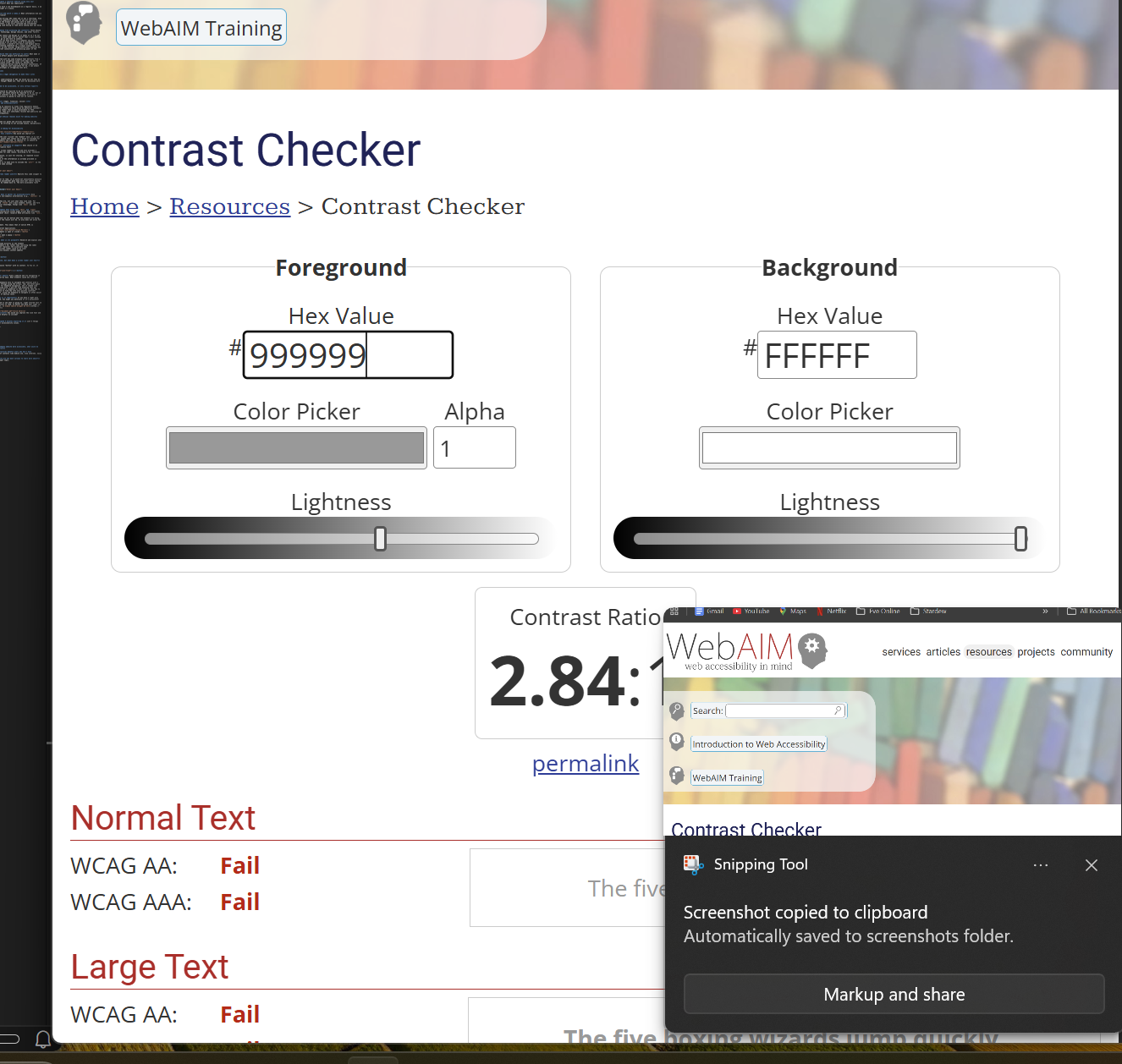
19. What is color contrast and why is it important? If you have a light gray text (#999999) on a white background, how might you determine if it's accessible?
Contrast makes it much easier to read or see what is going on. Light colored text on a light background can be very difficult to read, no matter how good your sight is. To check, I would use an online tool. A simple search for contrast accessibility brought me here and it indicated that the example failed the contrast test.
20. Look at this link: <a href="document.pdf">Click here</a>
What makes this poor for accessibility? How would you improve the link text and what additional information might be helpful to include?
This link is garbage, regardless of accessibility. It does not give any indication of what you are clicking, and the href is to a very ambiguously labeled document. I would not trust this link under any circumstance. From an accessibility standpoint, it does not tell you where it is pointing or what type of link it is (html, image, document, etc.) since the user is never going to see what the href is in most cases. to fix it, I would rename the pdf to something like 'AccessibilityCheatSheet.pdf' and update the element to <a href="AccessibilityCheatSheet.pdf">Here is an accessibility reference sheet</a>
Part 5: Real-World Application
17. Choose a popular website and spend 5 minutes exploring it. List 3 things that seem accessible and 3 potential accessibility issues.
Website: Blackboard
Accessible features:
- keyboard navigation is possible
- Layout is fairly intuitive
- built-in reader
Potential issues:
- some parts need to use enter key, others allow for spacebar as well
- having a seperate back button in the page for the sections means that the whole thing reloads if you accidentally use the browser back button
18. If you were hired to make a company website more accessible, what would be your first three questions or concerns?
- How much change are you willing to accept? If your site ends up needing a complete rebuild from the ground up, are you willing to do so?
- Are there any aspects that are non-negotiable? Are certain colors/color combinations a requirement (or deal-breaker) for you?
- Are there specific user groups, needs, or usage contexts we should consider when designing this site (older adults, assistive technology users, mobile-first users, or users in low-bandwidth environments)?
After AI-assisted polishing:
What level of updates are you open to — incremental improvements, structural redesign, or a full rebuild if needed to meet accessibility standards?
Are there any brand requirements (such as colors, typography, or layout elements) that must remain unchanged?
Are there specific audiences, accessibility needs, or usage contexts we should prioritize (e.g., screen reader users, keyboard-only navigation, mobile users, or low-bandwidth environments)?
19. How might web accessibility practices benefit users who don't have disabilities? Think about different contexts like mobile use, slow internet, noisy environments, etc.
Accessibility benefits all users. Like many, I often watch videos with no sound, so captions are very helpful. having a transcript is even better! I often look things up quickly on a mobile device so being able to quickly and easily navigate is a must. I am often on the go and look things up as the idea strikes me, so internet connectivity can be questionable. Nothing is more annoying than waiting full minutes for a page to load because cell service is spotty in a given location.
20. What aspect of web accessibility are you most curious to learn more about? This may help focus your research paper topic.
My biggest area of interest is finding ways to streamline the process of checking accessibility.